Projects (Brand Design)
AIRBLE Project
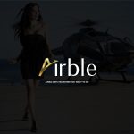
This brand visual identity project is designed for Airble, a private flight service located in Vancouver, Canada.
Airble is a luxury brand with a VIP target audience. To differentiate this brand from its few competitors, I used a combination of gold and dark gray color with light and combination and oblique lines layout that represents flight. Having a unified identity and designing the components of the collection in a special and unique way was important for the shape and appearance of the business of this brand. And all the advertising tools designed in this collection are tailored to the type of products and the needs of the audience.
- Logo Design
- Logo Sketch
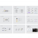
- Logo Guideline
- Business Card
- Letterhead Design
- Envelope Design
- Letterhead Design
- Airble
- Brochure Design
- Catalog Design
- Catalog Design
- Catalog Design
- Note book
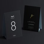
- Invitation Card
- Calendar Design
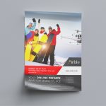
- Poster Design
- Stamp Design
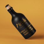
- Sport Water Bottle
- Bottle Design
- Bottle Design
- Water Bottle Design
- Mug Design
- Billboard
- Pop up design
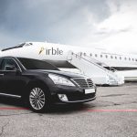
- Design on the Airplane
- Flag Design
- USB Design
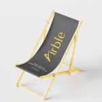
- Beach Chair Design
- Glass Desk Design
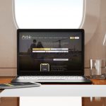
- Website Design
AC Project
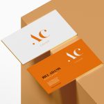
I implemented the AC brand visual identity project at the suggestion of a friend for seafood products, especially caviar. This product is produced in Oman with a warm climate. The audience of this product is people from the rich class of society. The choice of warm orange and dark gray colors and mixing with golden advertising materials represents a warm region and related products and is presented to an audience at the rich level of society. In the logo design, the combination of caviar seeds with other lines emphasizes the message of this logo.
- Logo Design
- Logo Sketch
- Business Signage
- Business Card
- Letterhead Design
- AC Caviar
- Magazine Design
- Packaging Design
- Packaging Design
- Business Card & Cup
- Menu Design
- Bottle Design
- AC Caviar
- Booth Display Stand
- Flag Design
- Mask Design
- Sticker Design
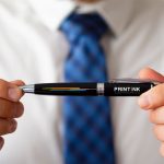
- Pen Design
ARSHAK Project
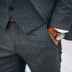
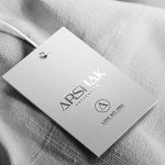
Arshak’s rebranding project is related to men’s classic clothing. The audience of this product is the middle and rich people of the society who are in the age range of thirty and above. After briefing this brand, we decided that unlike the previous visual identity of this brand, which was full of details and crowded designs with high color variety, this time I will give it a minimal identity with calm colors, gentle and at the same time luxury. Other recommended products such as Arshak men’s perfume, connect and ultimately increase the audience’s loyalty to the brand more than before.
- Logo Design
- Sketch Design
- Business Signage
- Arshak
- Business Card
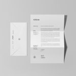
- Letterhead Design
- Letterhead Design
- Develop Design
- Catalog Design
- Catalog Design
- Magazine Design
- Catalog Design
- Pop Up Design
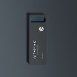
- USB Design
- Packaging Design
- Perfume Design
- Packaging Design
- Shopping Bag
- Arshak
- Tag Design
- Tag Design
- T-Shirt Design
- Shirt Tag Design
- Shirt Tag Design
C&C Project
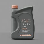
The C&C Visual Identity Project, designed for a car dealership in Australia. This company is in process of starting. The buyers of this brand are prosperous people of the society whose tastes are more compatible with elegant but simple and modern machines. Designing advertising tools for communication and more permanence in the minds of the target audience is one of the goals of this company.
- Logo Design
- Logo Sketch
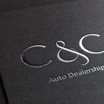
- Silver Logo Design
- Business Card
- Letterhead Design
- Develop Design
- Catalog Design
- Banner Design
- Uniform Design
- Logo On the Cap
- C&C
- Packaging Design
- Bus Stop Poster
- Magazine Design
- Package Design
- Sticker Design
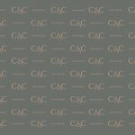
- Pattern Design
- Poster Design
- Book Cover Design
- Badge Design
- Billboard Design
- Decals Design
- Cup Design
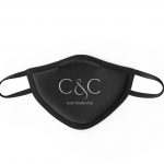
- Mask Design
DHS Project
This project is designed for a Real Estate company in the USA. After the necessary research of the brand, its potential audience, the community, and the need for the company’s services, we concluded that high simplicity and quick and direct understanding of the brand message is one of its important goals. Using only black and white colors, without details and making full use of the minimal space will help a lot in this strategy and will make it attractive.
- Logo Design
- Logo Sketch
- Business Signage
- Business Card
- Stationary Design
- Stamp Design
- Calendar Design
- Brochure Design
- Mug Design
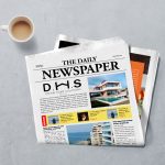
- Newspaper Design
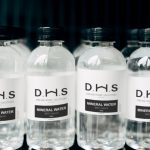
- Label Design
- Flag Design
HK Project
HK Visual Identity Project is designed for a modern building engineering and architecture company. The purpose of designing this logo is to position the name of the founder and architect of this company in the minds of the audience. (Ms. Hanieh Kazemi). This includes the first name (h) and surname (k) of this designer. It was very important to be minimal and of course to consider that the owner of this company is a woman with a curved and modern design vision. The goal of the company is to carry out modern and at the same time simple and fluid projects. I could get the message of this brand through the audience visually and quickly with this strategy.
- Logo Design
- Logo Sketch
- Stationary Design
- Business Card
- HK Co.
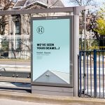
- Bus Stop Poster
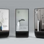
- Poster Stand
- Brochure Design
- Brochure Design
- Catalog Design
- Catalog Cover Design
- Logo Sticker
- Candle
- Logo on the Cup
- HK Co.
- Water Bottle
- Design for Pillow
- Design for Pillow
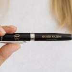
- Pen
- Blueprint Cover
- Helmet
LE PARK Project
Le Park Visual Identity Project was designed for a small but attractive coffee shop. This brand offers different products. All of these products are natural and produced by the company. The main product of this coffee shop is coffee. Therefore, I focused on coffee and the necessary tools needed to show this more to the audience. In the logo design to further emphasize coffee, the word P was combined with a cup of coffee. The thought behind using this degree of color is only to convey a sense of organic products and inspire a sense of life and nature. Ultimately, raising the real energy of the audience, get them to work harder, and save them from sleeping in the morning or at noon.
- Logo Design
- Logo Sketch
- Logo Sign
- Stationary Design
- Menu Design
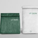
- Packaging Design
- Packaging Design
- Le Park
- Cup Design
- Packaging Design
- Cup Design
- Label Design
- Le Park
- Billboard Design
- Billboard Design
- Logo on the wall
- Packaging Design
LM Project
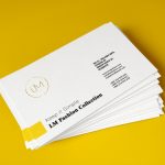
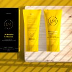
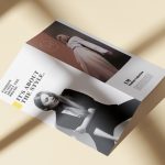
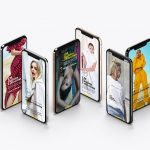
The LM Visual Identity Project is designed for the fashion team in Kuwait. Kuwait is a warm country and this brand likes to have an emphasis on the location as well. LM production is for young women. I used thin and curved lines to design the logo and combined it with yellow and gold colors to show the brand’s location. Our strategy in this project was to show simplicity, modernity, at the same time seriousness of the brand’s path. This resulted in creating delicate and simple lines and surfaces, but at the same time combining them with thick and large fonts.
- Logo Design
- Logo Sketch
- Pattern Design
- Letterhead Design
- Stationary Design
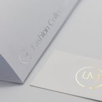
- Business Card Design
- Packaging Design
- Brochure Design
- Brochure Design
- Billboard Design
- Exhibition Stand
- Booth Exhibition Stand
- Cup
- Packaging Design
- Label Design
- UI & UX
- Bus Sticker
OTR Project
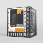
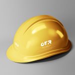
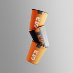
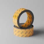
OTR Building Engineering Project stands for Oman stabilizes the way. The logo design is based on engineering structures, smooth and cut lines, and at the same time refers to simplicity and modernity. One of the reasons for using orange is to show the strength and young and energetic team of this brand. All the tools designed for this brand make the brand relationship with the audience more and more lasting.
Giving advertising messages to customers preserves the brand name and always keeps it in front of the audience.
- Logo Design
- Logo Sketch
- Business Signage
- Stationary Design
- Business Card
- Poster Design
- Billboard Design
- OTR Co.
- Book Design
- USB
- Helmet
- Flag Design
- OTR Co.
- Cup
- Badge Pin
- Sticker
- Logo on the Bag
- T-Shirt
ROSE BEAUTY Project
The Rose Beauty Visual Identity Project was designed for a friend of mine in Vancouver. This is a Hair Salon for women. This brand is away from sharp and repetitive colors such as pink and red. The purpose of designing this project is to create a sense of calm, modernity, and simplicity along with beauty, which is the ultimate goal of the brand’s audience.
- Logo Design
- Logo Sketch
- Catalog Cover Page
- Catalog Design
- Business Card
- Poster Design
- Packaging Design
- Packaging Design
- Bag
- Book Cover Page
- Mask
UNIX Project
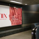
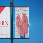
The Unix Visual Identity Project is a production of winter clothing, especially coats, for young women. Giving a sense of uniqueness and youth is the competitive advantage of this brand over competitors. In logo and pattern design, the use of soft lines, curves, and a combination of thin and thick lines in a balanced and beautiful way together and the use of a red-white color palette, all inspire youth, pranks, and sexiness for the audience. Also, the production of perfumes and creams for women in this brand can create a stronger and more loyal relationship between the brand and the customer.
- Logo Design
- Logo Sketch
- Store Signage
- Pattern Design
- Business Card
- Letterhead Design
- Envelope Design
- Envelope Design
- Poster Design
- Brochure Design
- Calendar
- USB
- Unix
- Juice Bottle
- Mug
- Billboard Design
- Billboard Design
- Outdoor Banner Design
- Unix
- Shopping Bag
- Packaging Design
- Perfume Packaging
- Cream Packaging
- Tag
UNICEF Project
The UNICEF project was one of the most important and lovable projects we did in Oman for 6 months with our video design and production team. The aim of this project is to support children, especially in the field of education and health. And finally, I designed the logo to show this strategy. The goal is to show the UNICEF management circle in Oman in the field of helping children. And to emphasize more between this project and the UNICEF collection, I used the UNICEF special blue color code in the design of the works.
- Logo Design
- Logo Sketch
- Stationary Design
- Catalog Design
- Catalog Design
- Roll Up Design
- Billboard Design
- Unicef
- Invitation Design
- Booklet Design
- Balloon
- Bottle Label Design
- USB
- Pin
- Unicef
- Mask
- Pencil Case
- Sticker
UK Project
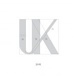
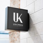
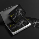
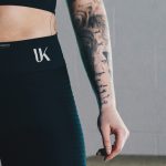
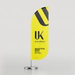
UK is a company that produces bodybuilding supplements. UK’s slogan is to build a beautiful body of your choice. I used yellow and its combination with black to design this brand. Showing these colors together shows high energy and strength. And all advertising tools such as logo design and brand color on dumbbells, glasses, water bottles, hats, and ready-made dishes for athletes can independently and permanently promote and introduce this brand and record it in the minds of the audience.
- Logo Design
- Logo Sketch
- Business Card Design
- Stationary Design
- Brochure Design
- Catalog Design
- Poster Design
- Poster Design
- Outdoor Poster Design
- Billboard Design
- UK Supplement
- Water Bottle Design
- Bottle Label Design
- Bottle Label Design
- Mug Design
- Packaging Design
- Packaging Design
- Packaging Design
- Packaging Design
- Label Design
- Leg
- Cap
- Logo on the Cloth
- Flag Design
- Mobile Cover Design
- Badge Pin
- Logo On the Wall
PRINTINK Project
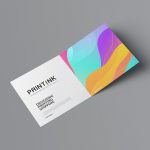
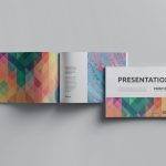
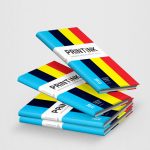
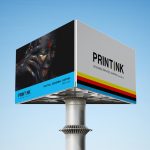
PrintInk printing house in the USA is a company with design, printing, and postal services. PrintInk has the advantage over its competitors to do all the work with high speed and quality. After the necessary research, we came to the conclusion that we should have an interesting name design of the combination of Print and Ink. In their domain, the word the US should be used to separate them from competitors and give them quick access to the city’s audience.
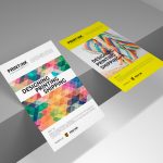
In designing the logo to emphasize the separation and at the same time the connection between the word now and print, I turned the word now into 4 main colors of printing. Also, by seeing the logo, the audience quickly realizes its original nature. Wherever you see the audience of any advertisement for PrintInk, the brand is immediately remembered. The whole package is connected like a chain for the cohesive shape, line, and composition of the design. It will also create a sense of satisfaction and happiness due to the different color combinations. In this brand, many different advertising tools have been used that constantly engage the audience everywhere. Eventually, it is positioned in the audience’s mind. All this is done so that whenever the audience needs these things, they immediately remember this brand and the services. since this brand has been presented on buses, billboards, city signs, flyers, and advertising glasses, etc., and has seen on a lot in advertisements. Therefore, it has been creating a sense of trust and security in the potential customer.
- Logo Design
- Logo Sketch
- Brand Book Design
- Business Signage
- Book Cover Design
- Stationary Design
- Letterhead Design
- Business Card Design
- Binding Catalog Design
- Cover for poster
- Desk Calendar Design
- Printink Print Shop
- Brochure Design
- Flayer Design
- Invitation Design
- Poster Design
- Booklet Design
- Catalog Design
- Booklet Design
- Billboard Design
- Outdoor Advertising
- Rol Up Design
- Exhibition Stand
- Logo Signage
- Printink Print Shop
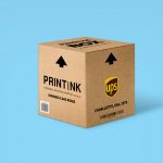
- Box Design
- Box Design
- Box Design
- Packaging Design
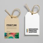
- Tag Design
- Mug
- Bottle Label Design
- Packaging Design
- Bus Sticker Design
- Car Sticker Design
- Cap Design
- Flag Design
- USB Design
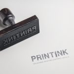
- Stamp Design
- Pan Design
- ID Card Design
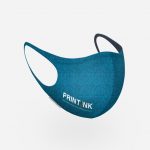
- Mask Design
- Door Tag Design
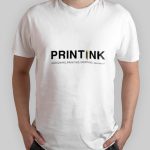
- T-Shirt Design
- Pin Badge Design
- Pillow
- Application Design
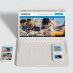
- Website Design
TR GOLD Project
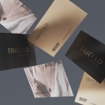
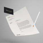
ln designing the visual identity of TR Gold brand, which is for selling simple and beautiful jewelry, considering the simplicity and modernity of the design is a priority of the plan. The logo design is executed with the feature of readability and simplicity and at the same time modern and luxurious by combining two colors, white and gold.
- Logo Design
- Logo Sketch
- Store Signage
- Business Card
- Stationary Design
- Gold Business Card
- Shopping Bag
- Flayer Design
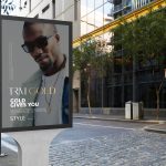
- Outdoor Advertising
- Jewellery Box Design
- TRM Gold
- Jewellery Box Design
TAVANCO Project
Tavanco is one of the construction companies in Vancouver. The main task of this company is to build simple and modern houses in order to protect nature and emphasis it as an important principle in human life. I decided to combine the letter (V) with the mark (checkmark) which is a sign of approval and use a combination of two colors green to design the logo. In logotypes, we can often use the word that has become an image as a sign logo independently or with a logo. My goal is to combine two colors of green and dark gray. This is the message that you can have a modern home without harming nature.
- Logo Sketch
- Note Book
- Business Card
- Stationary Design
- Envelope Design
- Invitation Card
- Calendar Design
- Folder Design
- Catalog Design
- Brochure Design
- Booklet Design
- Brochure Design
- Helmet
- Billboard Design
- Cover of Poster
- Mug
- Outdoor Tent
